- April 16, 2024

-
-
Loading
Loading
But 10 years is a long time, and even when we were installing that design here last year, we already were working behind the scenes on the look you see today.
We love it, and we hope you do, too.
When we decided to freshen up, we turned to the best — Mario Garcia and Mario Garcia Jr. — Tampa residents who are regarded among the world’s foremost newspaper designers (and the architects of our previous design). Lucky for us, they recommended we work with one of Mario Sr.’s proteges, Pegie Stark.
Truly, Stark’s aesthetic, enthusiasm and attention to detail are staggering. Make no mistake: Everything — and I mean everything — was considered throughout the yearlong redesign process. I’ve learned more about fonts, colors, balance and grids than I ever imagined. I also discovered that one of my “editor tricks” — i.e. squeezing a font here or there to save a line — is a big no-no.
“Every font is like a piece of art,” she told me. “Every single letter is hand-drawn, and the space between each letter is measured to work perfectly with all the others.”
Got it. No more squeezing.
And although this design may seem strange in this inaugural edition, know that every change was done with you, the reader, in mind.
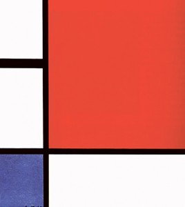
The design is inspired by Dutch abstract artist Piet Mondrian, who became famous in the 1920s for “asymmetrical balance” — lines and rectangles and simple, primary colors. You’ve likely never seen a newspaper quite like it, and that’s exactly what we wanted.
Why Mondrian? The style’s inherent balance satisfied all the items on our checklist. It gives our pages space to breathe — no longer are we cramming every nook and cranny with copy and photos. You’ll see much more white space — particularly between the stories and the advertisements — which allows both to pop more. Furthermore, our newspaper now only will use three different type faces, chosen for their readability.
And about that front page: With our previous iteration, we used it like one would an empty plate at an all-you-can-eat buffet. We’d stuff every millimeter we could with as much content as it would allow. We went for bold, loud, full. In Mondrian design, we’re using it more like a menu — an introduction or an advertisement to all the great content that lies within.
But perhaps our favorite part of the design is something you’ll never see — its 25-column grid. Everything — from the headlines and the stories themselves to the photos and ads — is aligned on a grid, giving us method and intent behind the space between each piece of content. Nothing is arbitrary, and we’ll be able to create wildly different looks and feels that all stay rooted and true to Stark’s vision.
I’m sure you also will have questions about the biggest change — the size. Do me a favor. Take this edition and hold it open at eye level. Next, take last week’s edition and do the same. Which is easier to hold? To read? Then, after you finish reading this edition, close it and stick it into your briefcase or laptop bag. See how it fits without an awkward second fold?
The reason for the size change is simple: It makes for a better reader experience.
After all, that has been at the heart of this entire process. Our goal was to give you a fast, easy, fun way to consume the hyper-local content you’ve come to expect from the West Orange Times & Observer. The front page is friendly, breezy and allows a little window-shopping. Our inside pages — although they look different — serve as our store stocked with news, events and photos.
It’s all here. It’s just even more fun to read.